Minimize Me
Minimize Me was created as a criticism of the digital art economy, relying on the visual language of pop art, minimalism, and user interface icons.
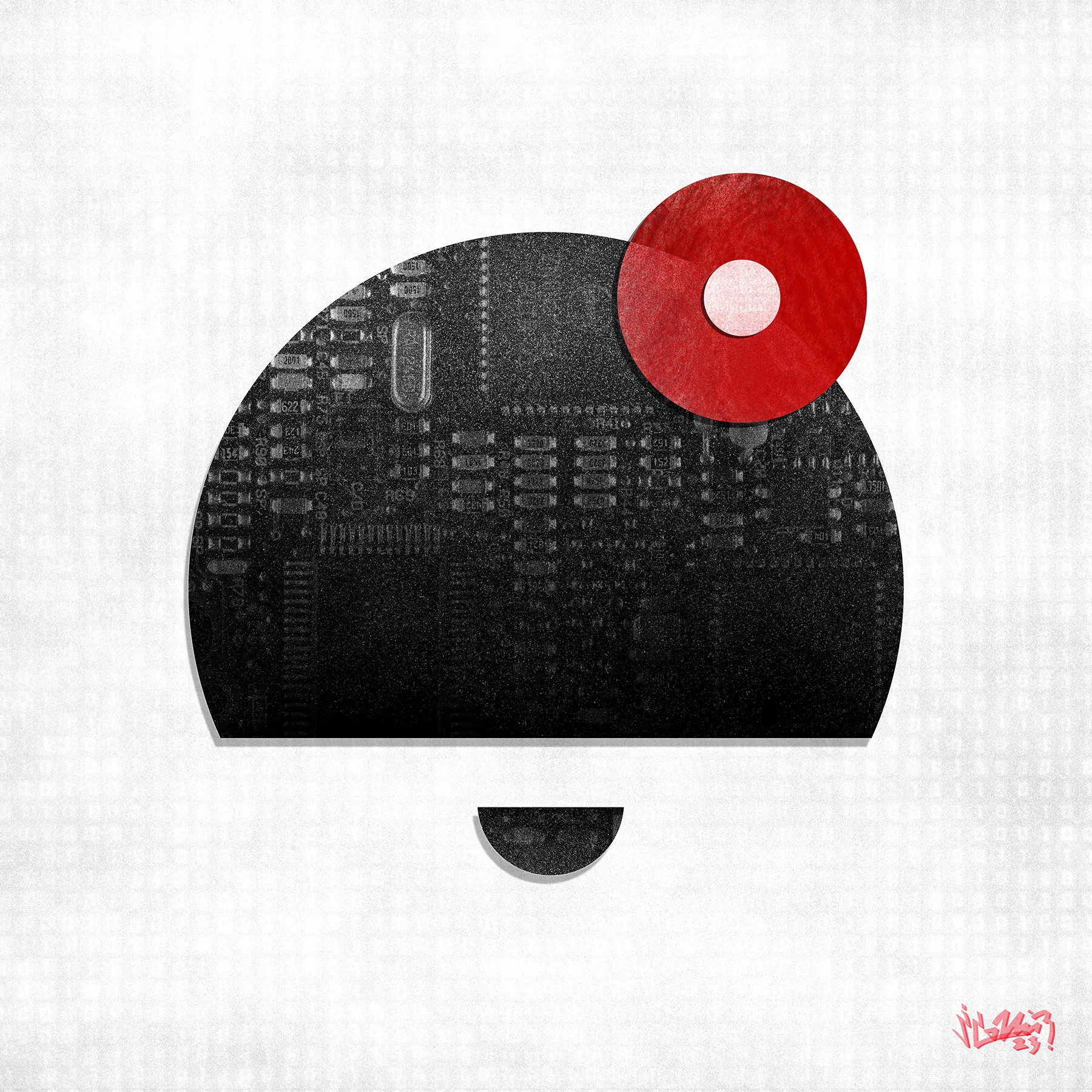
The concept was straightforward—grinding out art in exchange for red dots on social media is a historically bad deal. Never in history has the role of the artist been so utterly small, as we are forced to squeeze new work through the confines of these icons, triggering red dots for others and collecting them for ourselves, trading time and labor for short bursts of brain chemistry. It is exhausting and unsustainable.
From the point of exhaustion this aesthetic move was metaphorical but rational. I enlarged the icons into 36” square files, rendering them at nearly 100x their normal scale. Why? Because I have become smaller, and “The Red Dot” has become larger. By participating in this form of the digital art economy I enlarge the dots, enlarge the icons, and enlarge the apps and their creators, and in doing this, I minimize me.
The pieces of this series feature simple, aestheticized user interface icons that combine collaged references to red dots, fingerprints, illuminated pixels, and the underlying hardware that makes the technology possible.